Monday, December 10, 2007

Final Project


Data source

http://www.studyusa.com/?s=1&t=8
Welcome to study in the USA

http://www.internationalstudents.org/
How to survive in the USA


Interantional programms and services at GMU


http://admissions.gmu.edu/global/
International students Admission page at GMU

Tuesday, December 4, 2007

My favorite historical maps and, of course, couple maps of Russia

http://worldmapsonline.com/images/KR/kr-1833-us.jpg
This map is very artistic. It is not a great map from the geographic perspective of view, however it is not simply a map, it is “art and science”.

http://images.google.com/imgres?imgurl=http://www.loyno.edu/~seduffy/MapImages/FormerUSSR1990s-display.jpg&imgrefurl=http://www.loyno.edu/~seduffy/maps.html&h=419&w=550&sz=46&hl=en&start=9&um=1&tbnid=C6a9kinOX6DBWM:&tbnh=101&tbnw=133&prev= This is the way Russia looked under Peter the Great. The map is very interesting from the historical point of view. For those who are interested in Russian history!

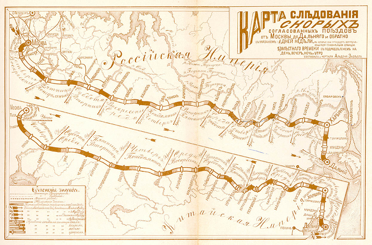
http://www.transsib.ru/Map/transsib-express-1903.jpg
This map is great! It shows the train rail from Moscow to Dalnii Vostok and from Dalnii Vostok to Moscow. The map has days of week and local time included. Unfortunately the map is not date, however it has the name of the person who did it – Aldona Zabillo.

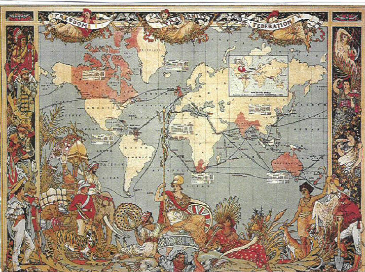
http://www.globalpolicy.org/images/empire/map1.jpg
This is historical map of the world. The content of the map is not the main focus; the main focus here is ART. I wish I can do something as beautiful as this map!

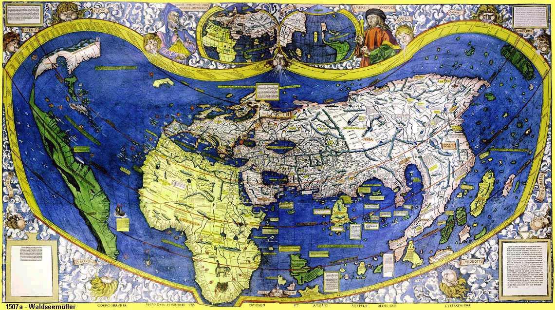
http://americanbacklash.com/WorldMap1500.JPG
Another historical map with a very interesting projection!!! The map has a lot of information on it, but it is too small to read! Like it anyway!

5 best maps from the blog

5 Great Maps from the Blog

I have looked at all the profiles of my classmates on the blog, and I must admit – I admire Alan’s work. I really like several of his maps, but I would like to highlight 2 of them.
http://2.bp.blogspot.com/_jWUOny42LF8/Rzj7XXrawII/AAAAAAAAACs/iFv71kTqjhI/s1600-h/ack_lab9_Natural.jpg
The map is nicely done; I just like looking at it! Colors are wisely selected and the legend looks well-thought and organized. The background is light grey, which highlight green (I would have never thought of it!). Just a well done map!

http://1.bp.blogspot.com/_jWUOny42LF8/RyTDwZvVrWI/AAAAAAAAACM/wC9Q9I7vUvs/s1600-h/ACK_Lab7_grey.jpg
This map is has a creative symbol, which is easy to read and to understand! Nice gradient!

https://blogger.googleusercontent.com/img/b/R29vZ2xl/AVvXsEhKL2xE1ig4HFauVDixXc25DEFuwQSM_QzT2t03JWUCtbw8qx9an5mSdqYmbpWqaaLEDyzvr-QIyFmgqc9XpnUuBgbrjXkdnbAbQMSZdje0z1HENkNv0hD6B7Uf0qGrPON94YmcmlWoClk/s1600-h/NCLandUseLab10.jpg
I really like Leanna’s bivareate map, I think she accomplished the goal to represent to different variables with as lot of creativity! One can easy identify 2 different representations on the map!


https://blogger.googleusercontent.com/img/b/R29vZ2xl/AVvXsEieFMnkpBe1O_6qNX4YNt_BVTcDiwxKxFtoE0uhr5KVl0zXRgrPv0Jvd2p5uKNBHKbj6aIiTv8q4Huo9t7n5geAELc5yWHbHjO7VATUa-2d-P8mHF_PoOX0b3olyytHiuWAfONU2bplTVED/s1600-h/Assignment-10.jpg
Sewit bivareate map is also great! It looks very clean and one can easily read the data! Like the layout!

https://blogger.googleusercontent.com/img/b/R29vZ2xl/AVvXsEj8KYJyufXWZGH8LTOZfb5AtnA7MGpsXQNcd4jRWQWoiTCA4nr7Fn-bbjrqam6QQ9ooxms-y9jHGgTY2zSWFNTAmDXTCiXXX-j-tnzbSnJ0qa1WJ8Dk4TtGO2Rl-5x5laTJLgjOrjf1dT-J/s1600-h/Assignment-9a.jpg
This map is very unusual! It is an interesting layout and attracts the attention!

Tuesday, November 20, 2007


Lab #10 was challenging. I have tried different colors and layouts, this one looks best of all. The data I have selected represents the total popualation and percent of bachelor's degree ages 25+. I have shown the map to several friends, and all of them, to my relief, were able to read it properly. Now it is up to the main judge!
Happy Thanksgiving!

Tuesday, November 13, 2007


Not the best population map, but colors are interesting.


Updated version!

Monday, November 12, 2007

I hope you enjoy my color map of Percent of the Total Population Who Are 65 Years and Over. I have chosen orange -red colors since those are the colors that usually represent populations. In my opinion, my map on the web and my printed map can be interpreted differently, however, the web one looks better than the printed one. There are several reasons for this conclusion: the colors on the web copy look closer to each other and the steps of enhancing the color look reasonable; the font does not appear to distract the audience's attention from the map. However, the printed version's font looks too bright and its colors from the least to the most bright one does not look like they belong in the same family of colors. The orange color on the web copy attracts the most attention, yet on the printed one the red is most visible. The least enhanced color on the web looks off white, however, on the printed copy it appears yellow. On both maps you can identify six different classes, but the web copy is easier to look at.